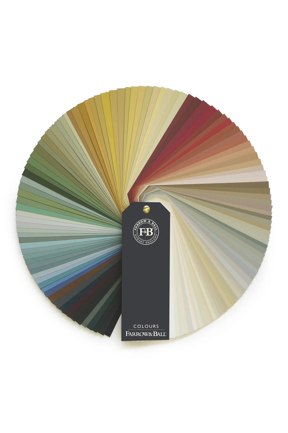
Farrow and Ball Fan Deck
Neutrals are popular in design because they harmonize with nearly everything and allow other colors and patterns to be used as accents, typically without issue. Whether by use of an alternate paint color or the surrounding décor, creating depth in your personal palette is achievable. That being said, while choosing a neutral may seem simple, there are several factors to consider in choosing which neutral best suits your environment.
One of the working definitions of a neutral is to describe it as a hue not appearing on the standard color wheel, which consists of primary, tertiary and secondary colors. However, if you go to the paint store and look at a fan deck, you’re going to see primary, tertiary, secondary and neutral tones. Blacks, whites, grays, and browns are commonly considered neutrals and, with that, all of the neutral tints, shades, and hues available in those tones means choosing a neutral is not always easy. Additionally, each company has different formulas, uses different color bases, and has their own methodology for creating their line. Many people find neutrals more difficult to work with than absolute color, especially given that there are ten-odd versions of a paint color called Swiss Coffee, and they are – of course – all a different shade by the same name.
When looking at neutrals, keep in mind that a neutral – except for 100% black or 100% white – has another color in it. Whether or not you can see the underlying tone is dependent on a variety of things: spectral perception, your immediate surroundings, and lighting are some of the key ingredients in how we see color. Another important factor that affects how we discern color is application. It’s important to note that you should NOT pick out a paint color from a website where you spent the afternoon colorizing a computer-generated bedroom, order 20 gallons and then slap it on your house without first purchasing a sample quart and testing a few areas around your home. If you’re looking at paint colors on a wall or ink on paper, versus color on a computer, you’re looking at two completely different colors in reality. One reason for this is that on tangible surfaces we are using a subtractive color method. Subtractive color means that we begin with white and end with black and, as we add color, the result gets darker and moves toward black. On a computer screen, we are working with light and using an additive color method, which begins with black and ends with white as more color is added. When you see terms like CMYK and RGB, this is what defines whether you are using a subtractive or additive color method, and a monitor read of color is different than an applied read. I like to think of it as light shining on something, as opposed to light shining through something.
Wow! Picking a neutral sounds really hard, Dirty Girl Construction! What’s your advice?
Why, thank you for asking. Happy to help!
You can always call on a professional to help you. Whether you choose a designer, decorator, an architect or the color specialist at your local paint store, there are people out there who can help you understand what works best for your environment.
If you feel able to do this on your own, then grab a fan deck and – literally – fan it out in front of you. Look at the neutrals and the grayscale sections. This is the easiest way to see the subtle differences between shades and pick up on the underlying tones – green, blue, red, purple, yellow, orange – in any neutral. Play around by placing other colors, fabrics and finish elements that speak to you next to the neutrals so you can see how those items change your color perception.
Once you’ve selected a few, buy sample quarts and try them out around your house where the light plays differently throughout the day. As mentioned, within each neutral, there are shades and hints of other colors, and lighting plays a big part in how these colors read in the room. Natural, incandescent, or fluorescent lighting could mean that the off-white shade on the wall winds up with a greenish tint; LEDs can cast any number of tones but most commonly read as blues or yellows. If you evaluate your choices in different lighting environments at different times of the day, this will give you your most accurate study.


